InEight · Interaction Designer
Building the company's first design system and cutting design and development times across an enterprise suite
Our base UIs were all extremely disjointed and any design change was expensive
Our product suite had grown without a shared visual language. The result was a fragmented experience that left users confused when working through different tasks. It got even worse when switching between applications.
On the inside, the same problem looked like this: any design change, no matter how necessary, was a long and expensive process. Without shared components, updates had to be made individually across products. That friction made teams reluctant to improve things even when they knew they should. We were tasked with fixing this by building the company's first design system. Our goals were:
- UI Unification — a consistent visual language across all products
- Unified Iconography — one icon library, no more duplicates
- Reusable React Components — shareable across teams
Starting small and building up
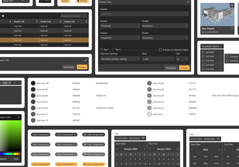
We followed the atomic design process — starting with the smallest components first and building up to larger pieces that in some cases used five or more smaller components. This let us scale quickly and not have to trip over details as we worked.
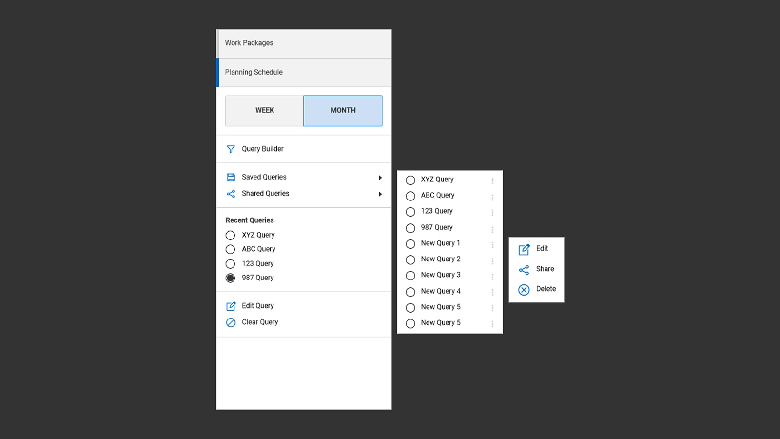
A lot of rules were created to handle almost every scenario. Here I'm showing how a snowman menu functions across states.
The tools and features I was designing for were often complex. One example: a query building tool meant to sort through millions of entries of data. Getting this right required careful interaction modeling before it could become a reusable component.
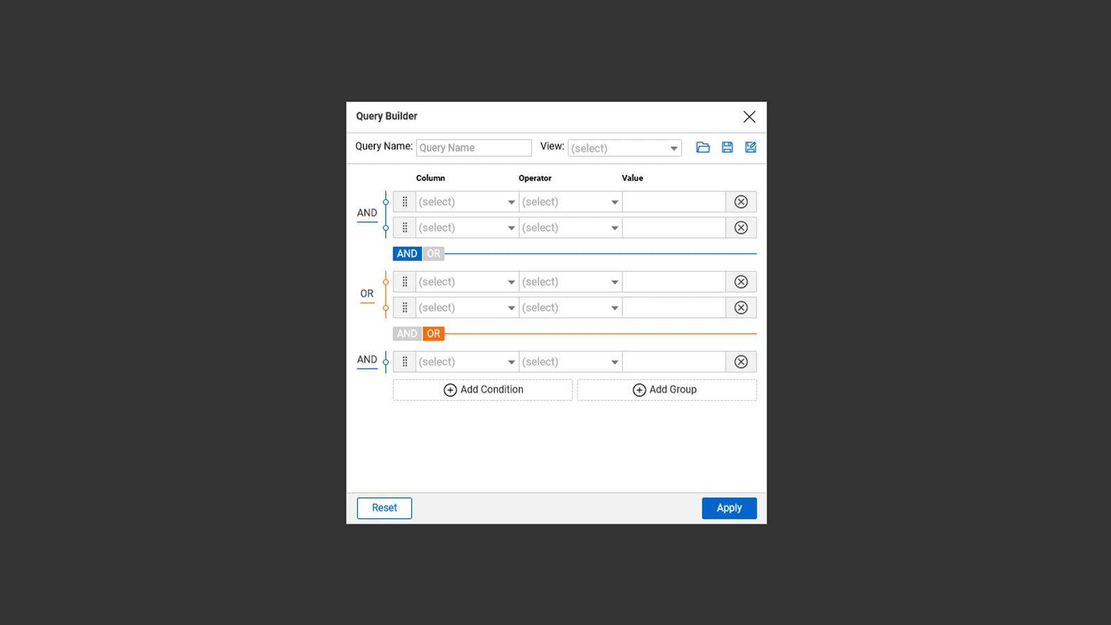
A unique query building tool designed to handle millions of data entries.
A new feature was also added during the project: a messaging app meant to handle conversations that take place around specific features in our products. Designing this inside the system was a real stress test of the component set.
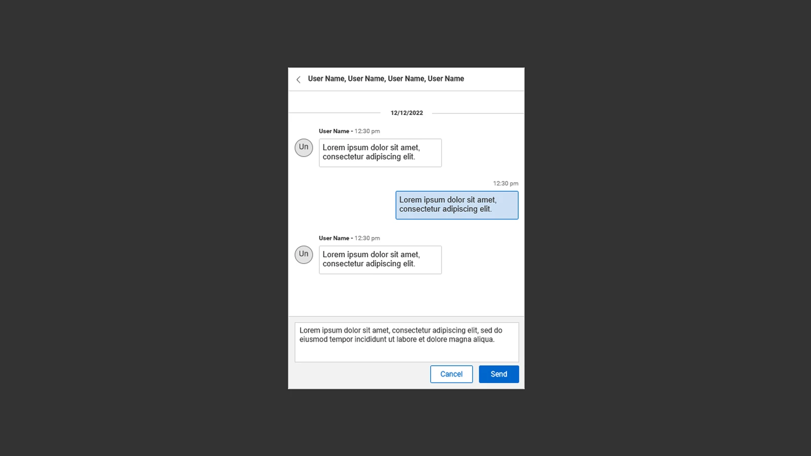
The in-product messaging feature — added mid-project and fully built within the Formwork component set.
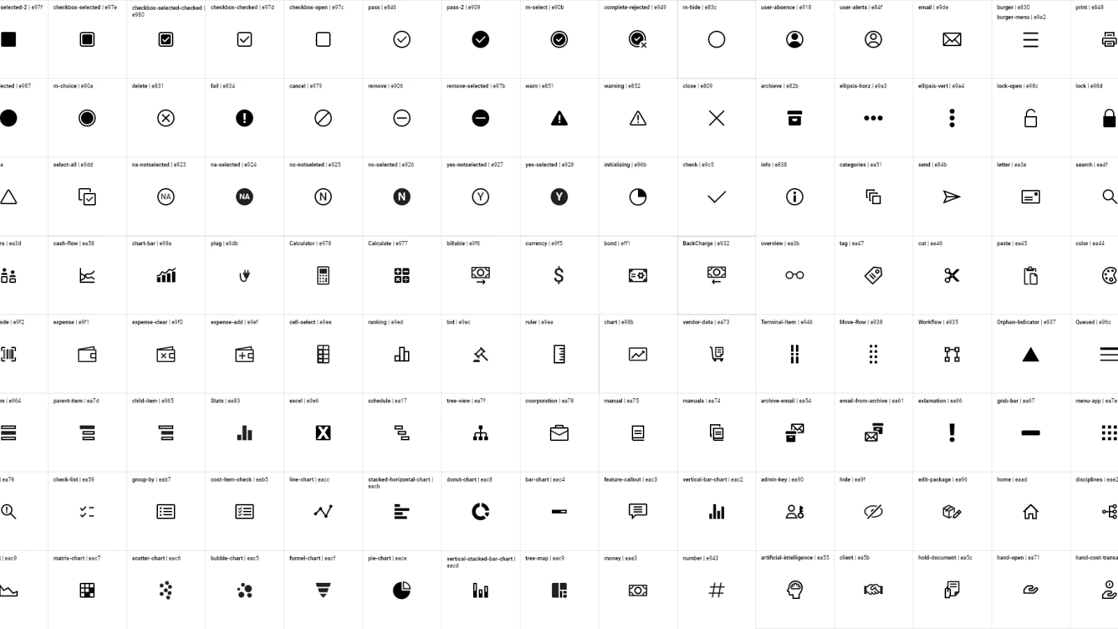
Over 700 icons — from chaos to one unified library
Our icons were also all over the place. In many cases one icon was being used for a few different scenarios across products. We created a library of 700+ icons to fit the needs of all our product teams — and in doing so established a unified brand and identity across the suite.
The complete icon library — built to eliminate ambiguity and serve every product scenario.
Shared components. Faster teams. One visual language.
The design system was built in React to allow developers to reuse components and share implementations across teams. System change how teams work. Updates that used to require coordinated effort across multiple products can be made in one place.
Formwork also connected directly to the InEight Model redesign: the Formwork Design System built during that project fed into desktop style guides foundations, and together the two projects aimed to give the full product suite a coherent visual identity for the first time.